30 years of rock typography: Yes
Cristy Scoggins
yes is one of my favorite bands. shut up—they're cool. anyway, the band logo's typeface has changed over the 40+ years they've been making pretentious tolkien rock. here are five examples, spanning 1969–1999.
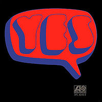
this is the very first yes album, released in july 1969. check out the groovy word balloon. they're making a countercultural statement, dammit! and they'll do it with flutes and and self-indulgent guitar solos!
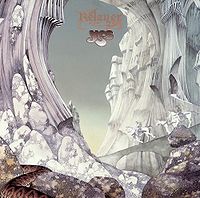
by 1974, the band had experienced ego problems/personnel issues/overblown stadium tours AND acquired roger dean as album artist. he designed this logo, which became the band's most recognized.
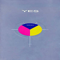
the '80s strike. the logo is cold, clinical, rigid. no more whimsy, no more humor. and the public loved it. "owner of a lonely heart" became their first (and only) #1 single.
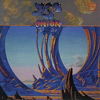
surprise, surprise! in 1991 the members of yes swallowed their pride, overcame their differences, and earned huge paychecks for the requisite reunion. notice how the album recaptures the '70s vibe. by the way, i saw this tour, and it kicked royal ass. rick wakeman rules!
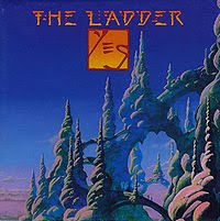
yes meets the millenium. by 1999, the logo's type is sparse, almost apocalyptic and broken. but the band's still churning out albums and shaky tours—probably to pay for assisted living and viagra.


